Extra blocks
Intro
In CMS we use also Extra blocks - this extra blocks can be used in CMS block, Partnership and Product updates. As CMS block, extra block has type and fields. At the top of the list of extra blocks, you can see the available extra types for this entity (since each CMS block can have different extra fields, so the user needs to know which extra type can be added to the CMS block).
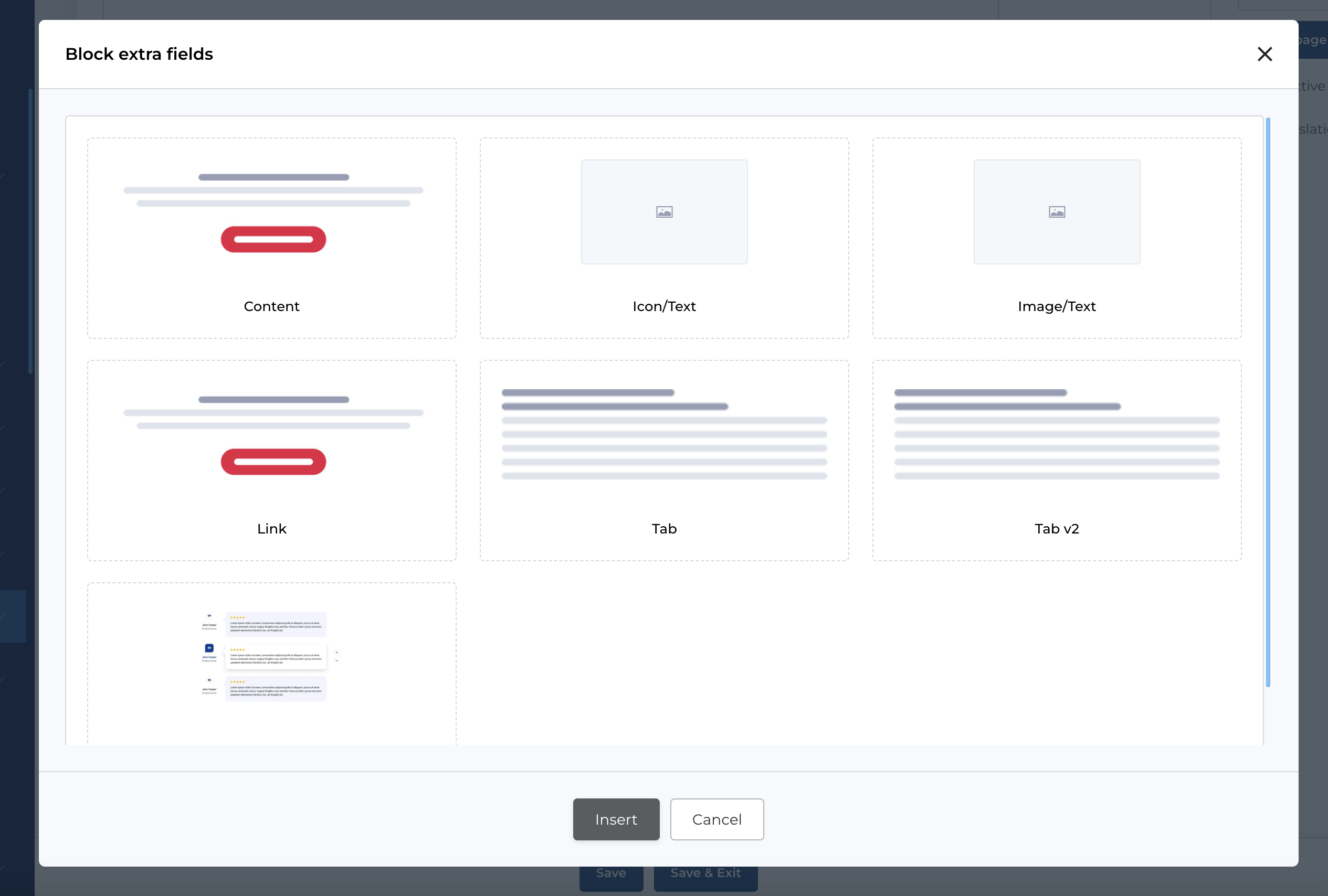
If extra blocks available for entity - you can add extra block by clicking Add block extra field button in section Extra blocks. This will open modal, where you can select block type.
Extra block editing form is in the modal, which you can open by clicking Edit icon on the extra block.
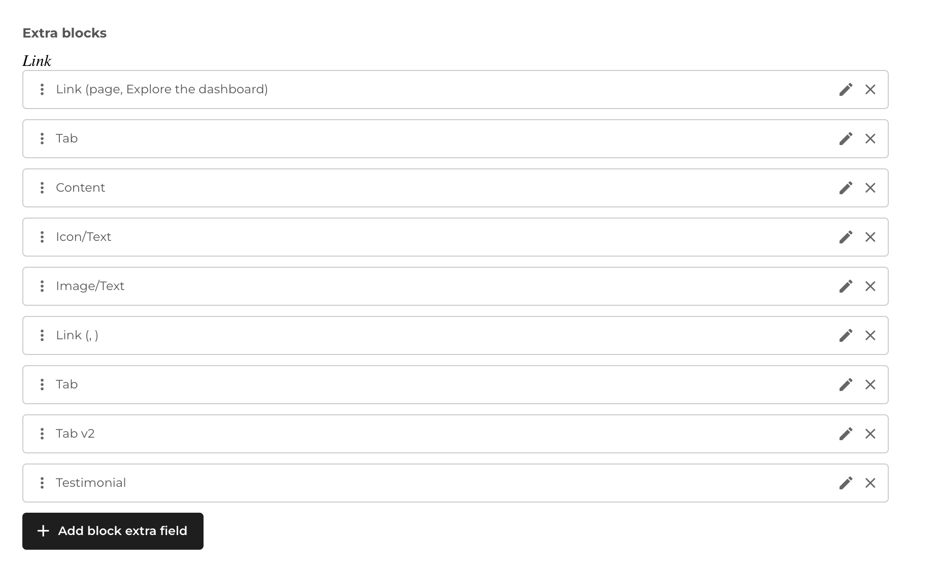
Type of extra blocks
The extra blocks can be one of next types:
- Content
- Icon / Text
- Image / Text
- Link
- Tab
- Tab V2
- Testimonial
After you selected type and clicked Insert button - new extra block will be added to the list. Now you can edit it by clicking Edit icon on the block item.
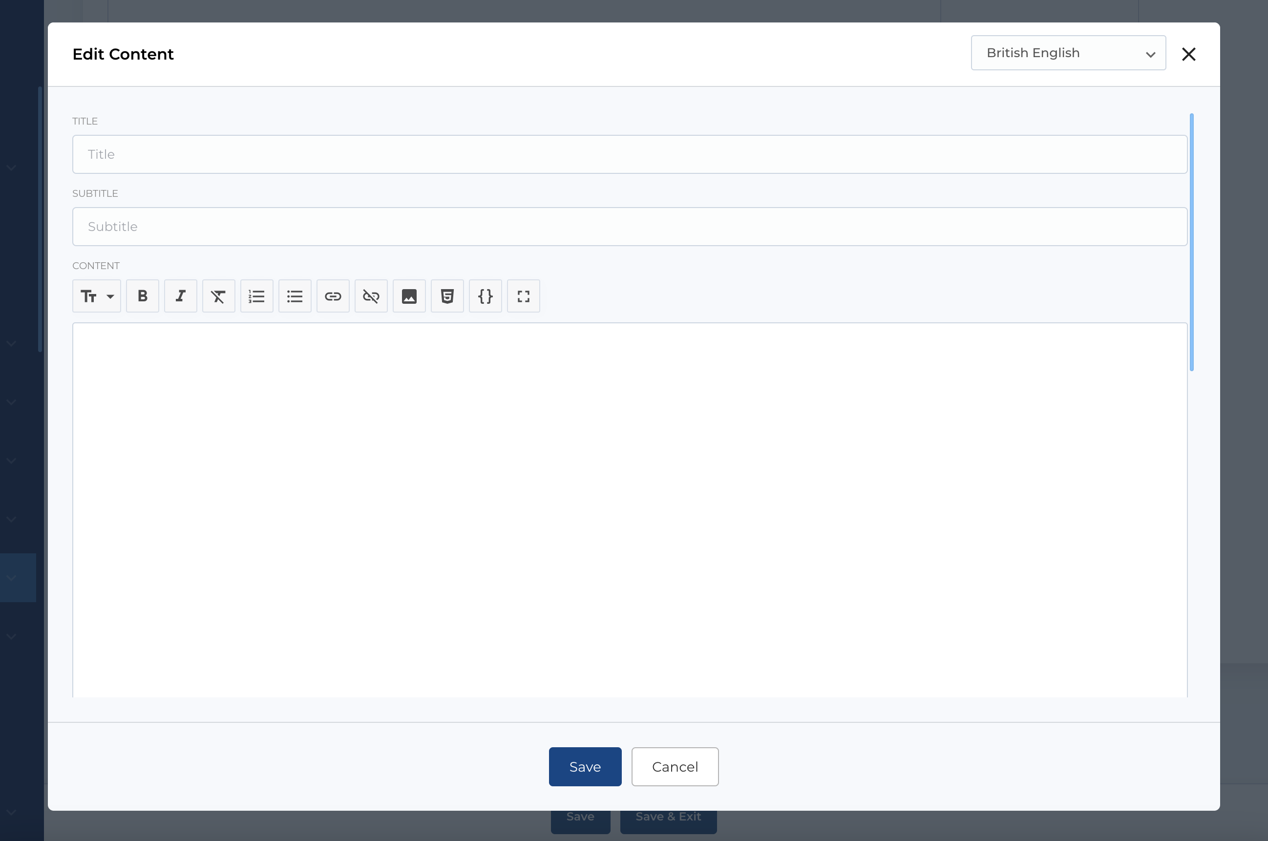
Content type
Extra block Content has some fields, which used in different places in CMS blocks.
Available fields:
- Title: Title of the extra block.
- Subtitle: Subtitle of the extra block.
- Content: Markdown editor for content.
- Checkbox (not used for now)
- Button configuration: Section where you can configure button.
Icon / Text type
In this extra block you can select icon (from predefined or custom icons). Also fill some texts and configurate button.
Available fields:
- Icon selector: Icon picker.
- Title: Title of the extra block.
- Content: Markdown editor for content.
- Button configuration: Section where you can configure button.
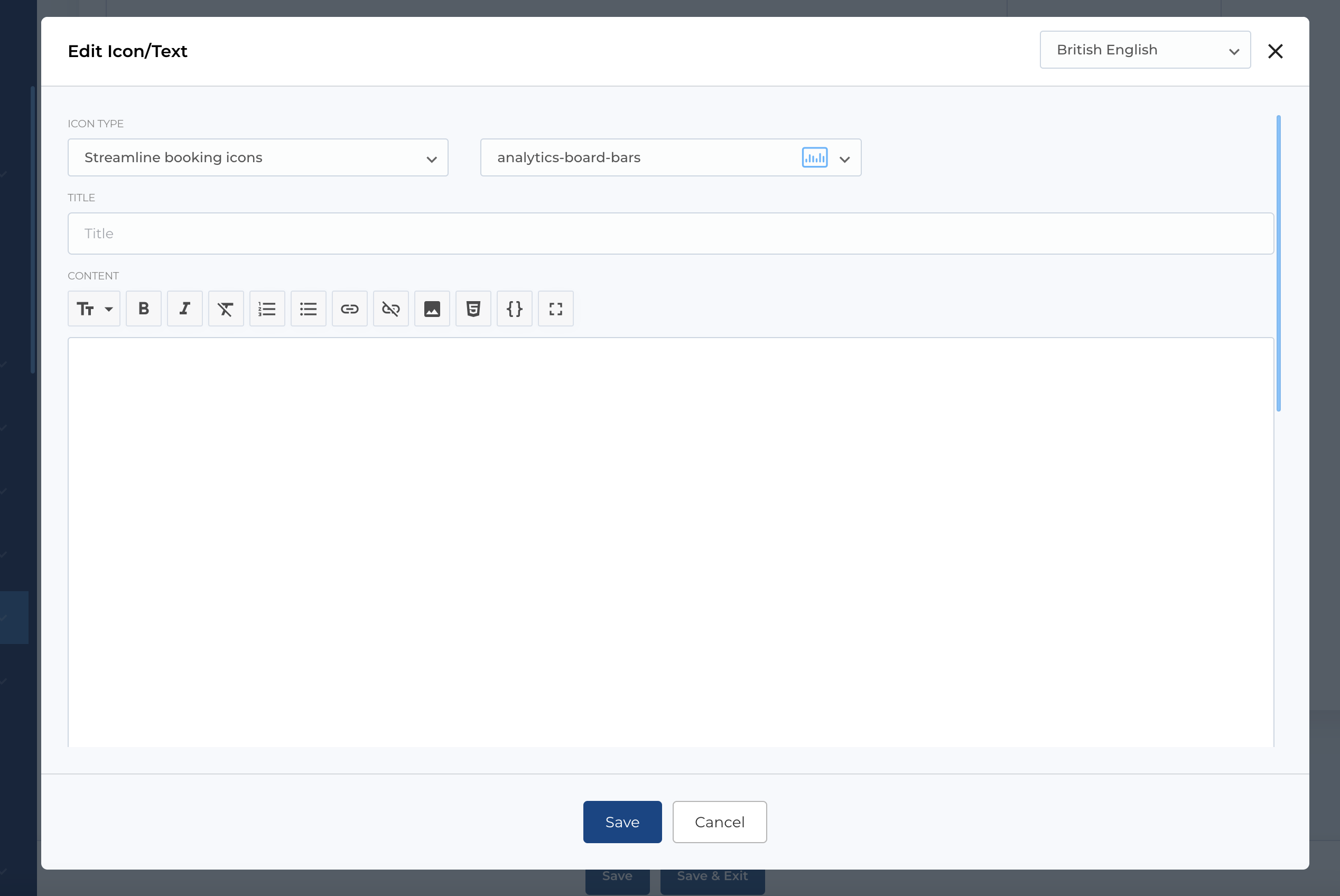
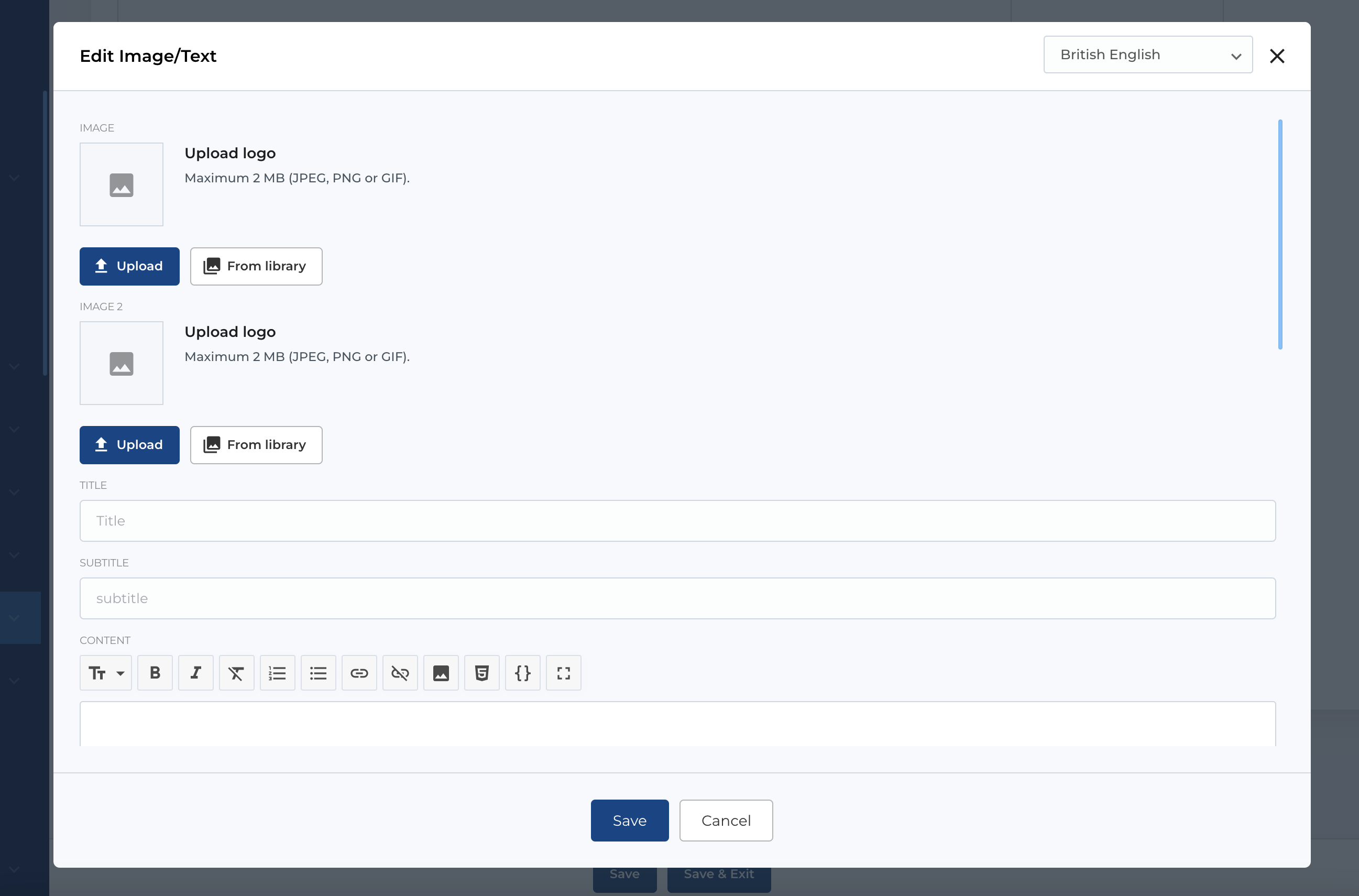
Image / Text type
This extra block type has two image pickers, but for now we have blocks where used only one image, so Image 2 can be empty.
Available fields:
- Image: Image picker for adding a photo.
- Image 2: Image picker for adding a second photo, not used for now.
- Title: Title of the extra block.
- Subtitle: Subtitle of the extra block.
- Content: Markdown editor for content.
- Button configuration: Section where you can configure button.
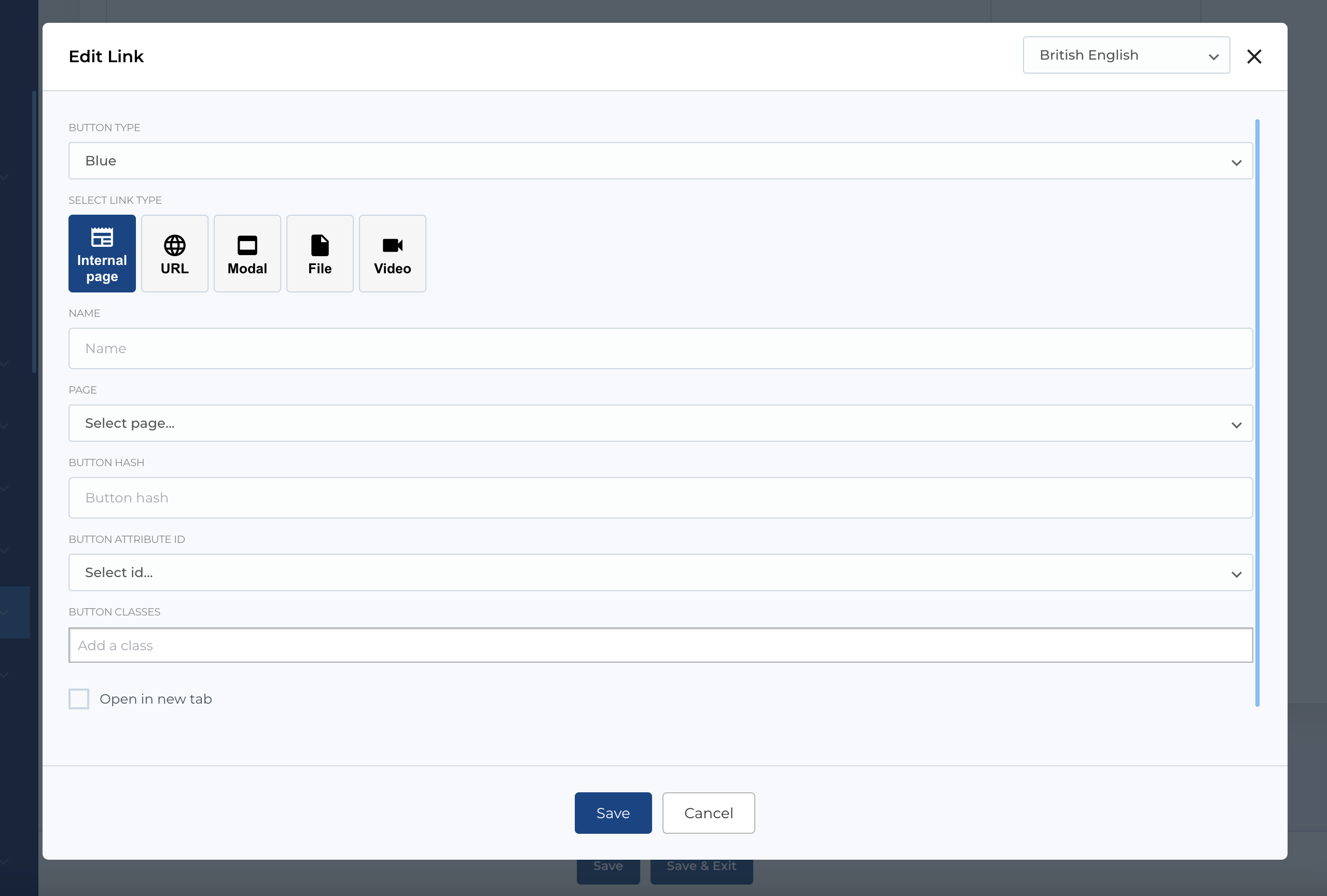
Link type
The most used type of extra block - is Link type - it's available almost for all blocks and entities (listed in Intro section). With this extra block you can configure links / buttons with link title, target, attributes, styles, etc.
Available fields:
- Button type: Type of button / link.
- Button configuration: Section where you can configure button.
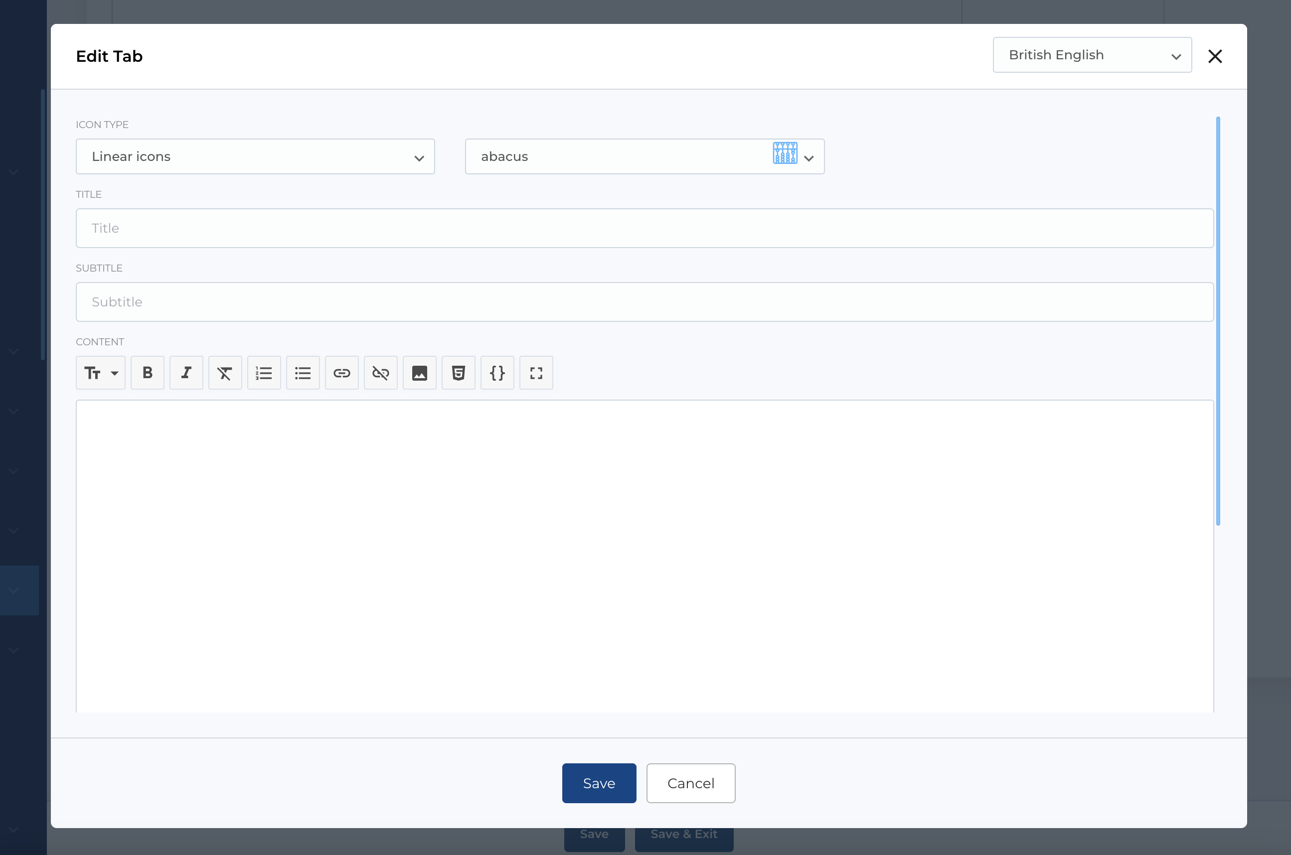
Tab type
Tab type used in such blocks like Tabs, Tabs v2, Tabs v4, Tabs v5, Tabs v6. Here you can select (from predefined icon or custom icon), texts and image.
Available fields:
- Icon selector: Icon picker.
- Title: Title of tab block.
- Subtitle: Subtitle of tab block.
- Content: Markdown editor for content.
- Image: Image picker for adding a photo.
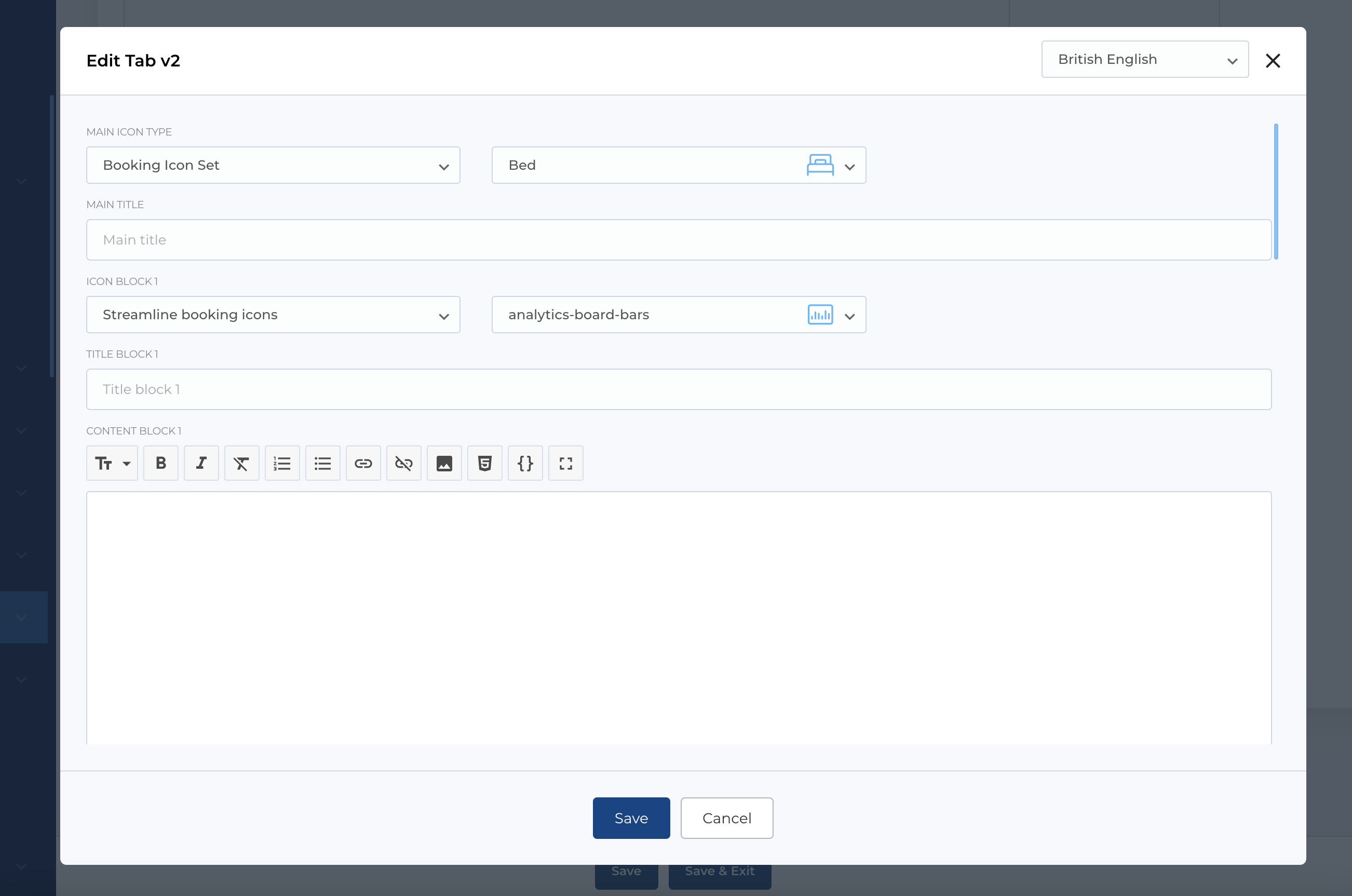
Tab V2 type
Tab type used in block Tabs v3. Here you can select icon (from predefined or custom icon) as main icon and fill fields (like icon and texts) for each of 4 sections of tab.
###Available fields:
- Main icon: Icon picker.
- Main title: Main tabs title.
- Icon block 1-4: Icon for each tab.
- Title block 1-4: Tab title.
- Content block 1-4: Markdown fields.
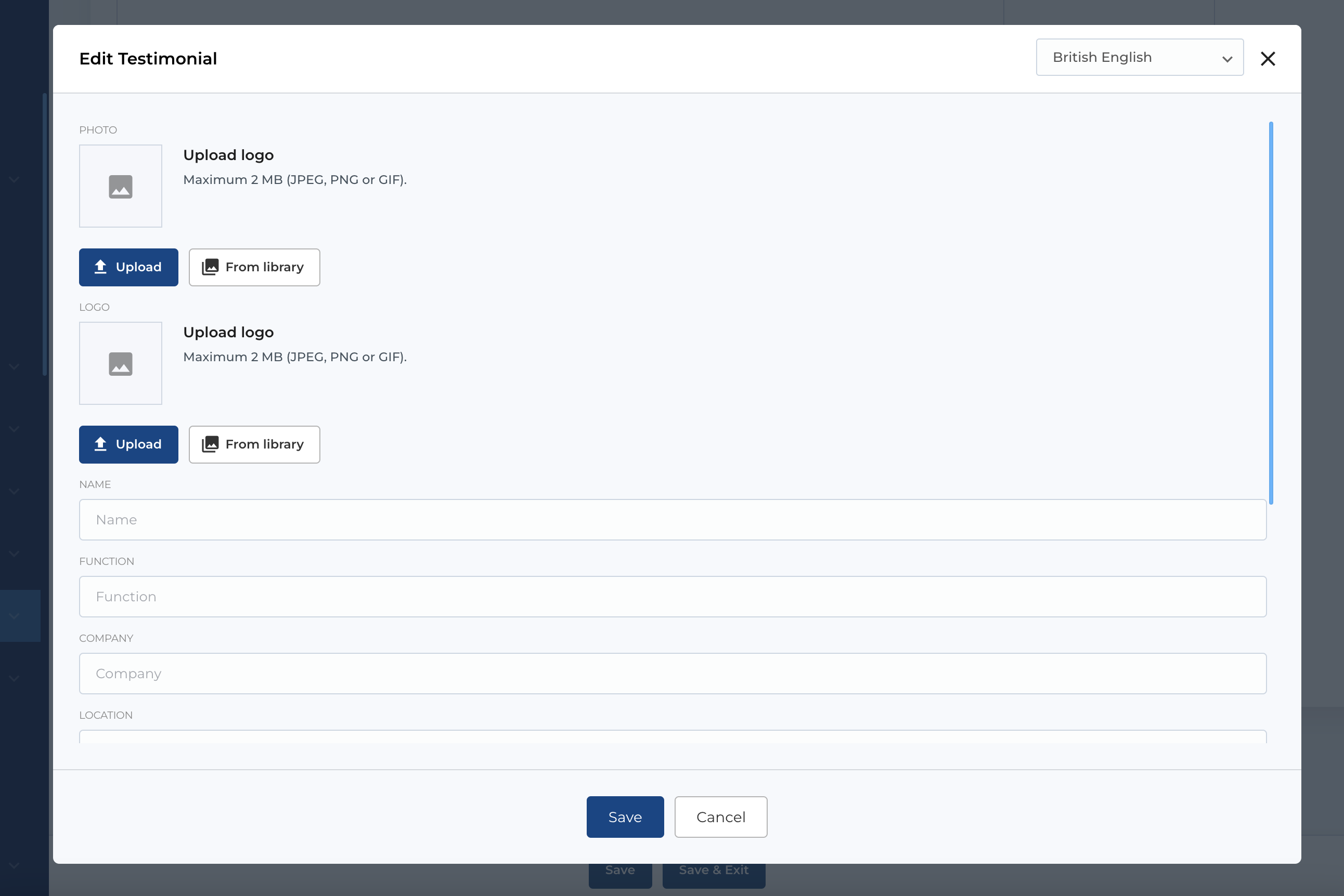
Testimonial type
In this extra block type you can add some images, fill texts and this values will be used in blocks Testimonial (v1 - v20).
###Available fields:
- Photo: Image picker for adding a photo.
- Logo: Image picker for adding a company logo.
- Name: The name of the individual.
- Function: The role or position held by the individual.
- Company: The company where the individual works.
- Location: The location of the individual or company.
- LinkedIn: A link to the individual's LinkedIn profile.
- Stars: Rating (single select).
- Content: The testimonial content.