Styling guidelines
Design requirements
- All sizes mentioned below are for the standart screen size of FHD - 1920x1080. The sizes will automatically adapt in case the screen size get's lower, but not when it will get bigger.
- Please provide designs with a screen size (width) of max 1920px, not bigger.
- Always provide design for mobile version
Colors
- primary blue #006CE4 (can be lighten or darken on 10%)
- headings color #003B95
- inner headings color #30373b
- texts color #000000
- orange color #FDBC01 (can be lighten or darken on 10%)
- border color #D9D9D9
- shadow 2px 8px 10px rgba(0, 0, 0, 0.06)
Text sizes and weight
Texts
Main font: BlinkMacSystemFont (-apple-system) Icons font: Material design icons
Headings
All headings (h1, h2 etc.) will have font weight 700.
Some words from heading can have decoration with underline of orange color (decoration is per word, can not be applied randomly.
Font-size in stock for headings:
- h1 60px
- h2 35px
- h3 27px
- h4 22px
- h5 20px
Paragraphs
- font-weight 400
- (standard) font-size 16px, line-height 24px
- (small) font-size 14px, line-height 22px
- (strong) standard + font-weight 600
Buttons
- width: fit content (auto)
- height: 42px (standard) / 52px (large)
- border-radius: 2px
- text params:
- font-weight 500, font-size 14px, line-height 20px (standard) /
- font-weight 500, font-size 18px, line-height 24px (large)
orange button
- background #FDBC01
- text #000000
white button
- border #006CE4
- background #ffffff
- text #0071c2
blue button
- background #006CE4
- text #ffffff
Sizes / Spacings / Margins
Content box
Main content box size 1170px. No content will go across this width, except blocks with carousels (like logos)
Outer spacings and paddings
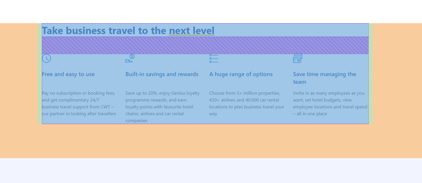
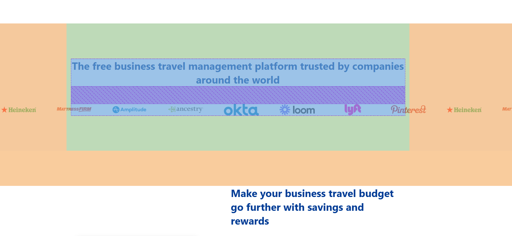
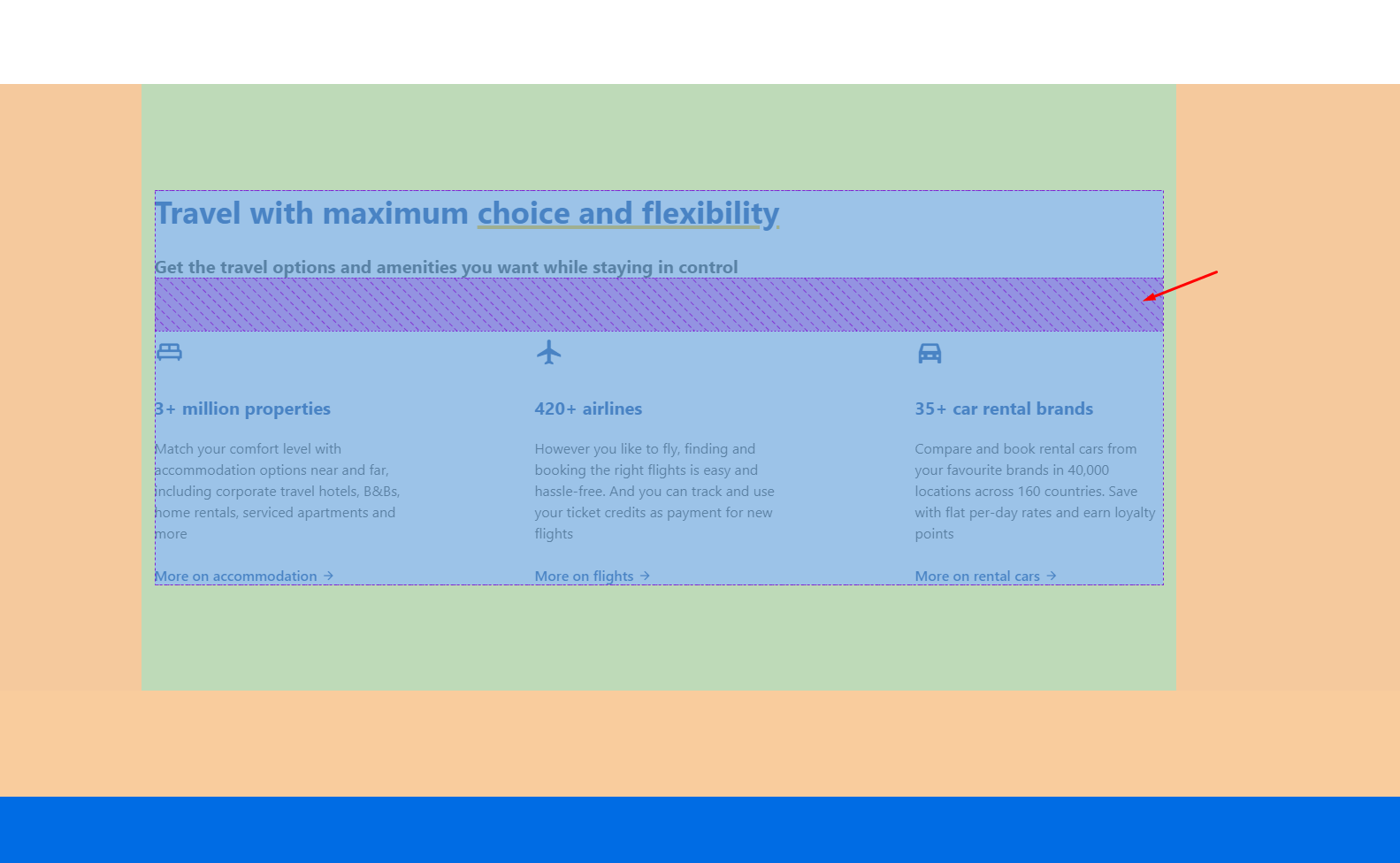
As we have 2 different types of blocks (with background and without background) - we have 2 different setups we can use. The default spacing between blocks is 120px (orange on screenshot), and no padding inside the block, but in case we have background - we have a setting to remove or not the outer spacing (used in case 2 blocks with background go in a row, and by default we will also have inner padding of 120px (green on screenshot)
Inner gaps
We have 3 different setups for inner gaps (elements of same block).
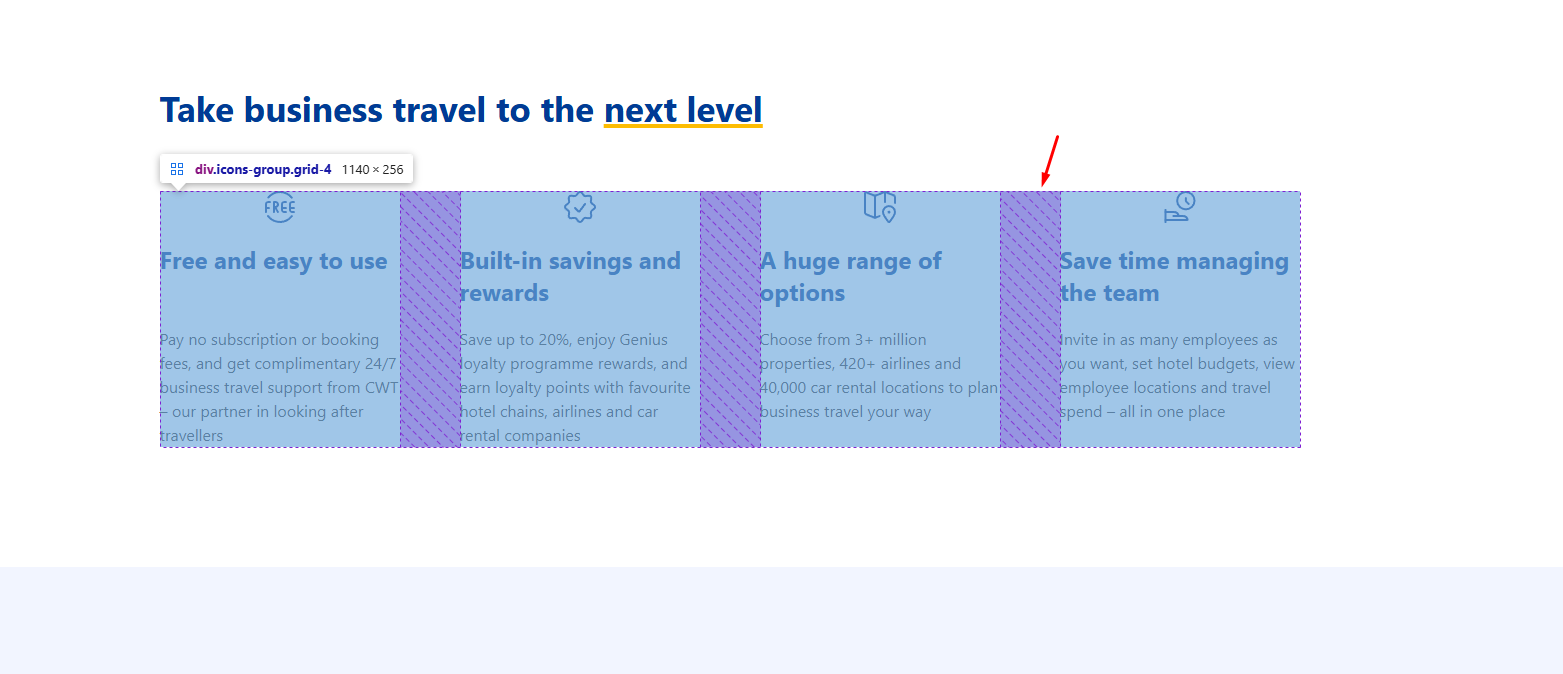
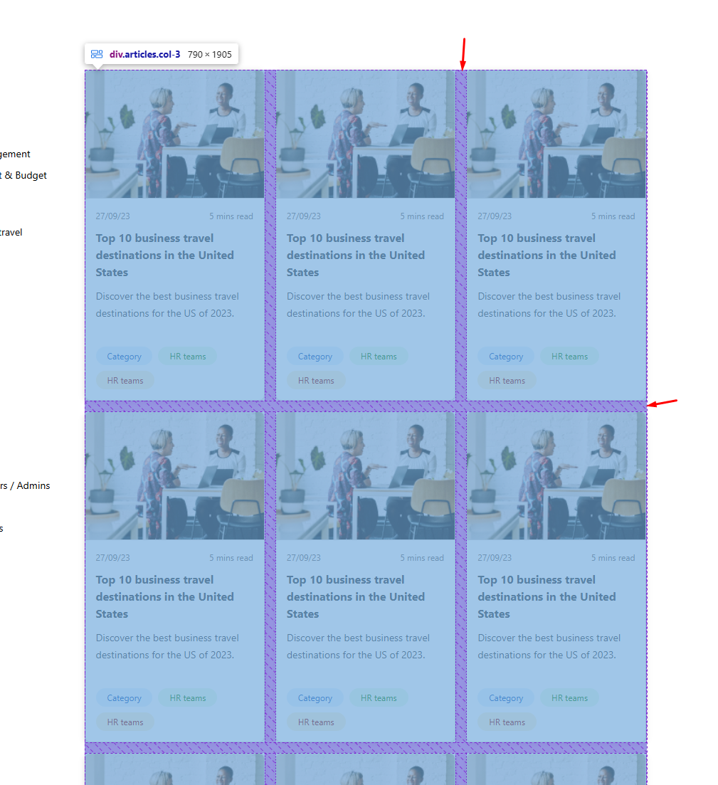
- 15px (usually used for cards / filters) (second screenshot)
- 30px (usually used for sliders)
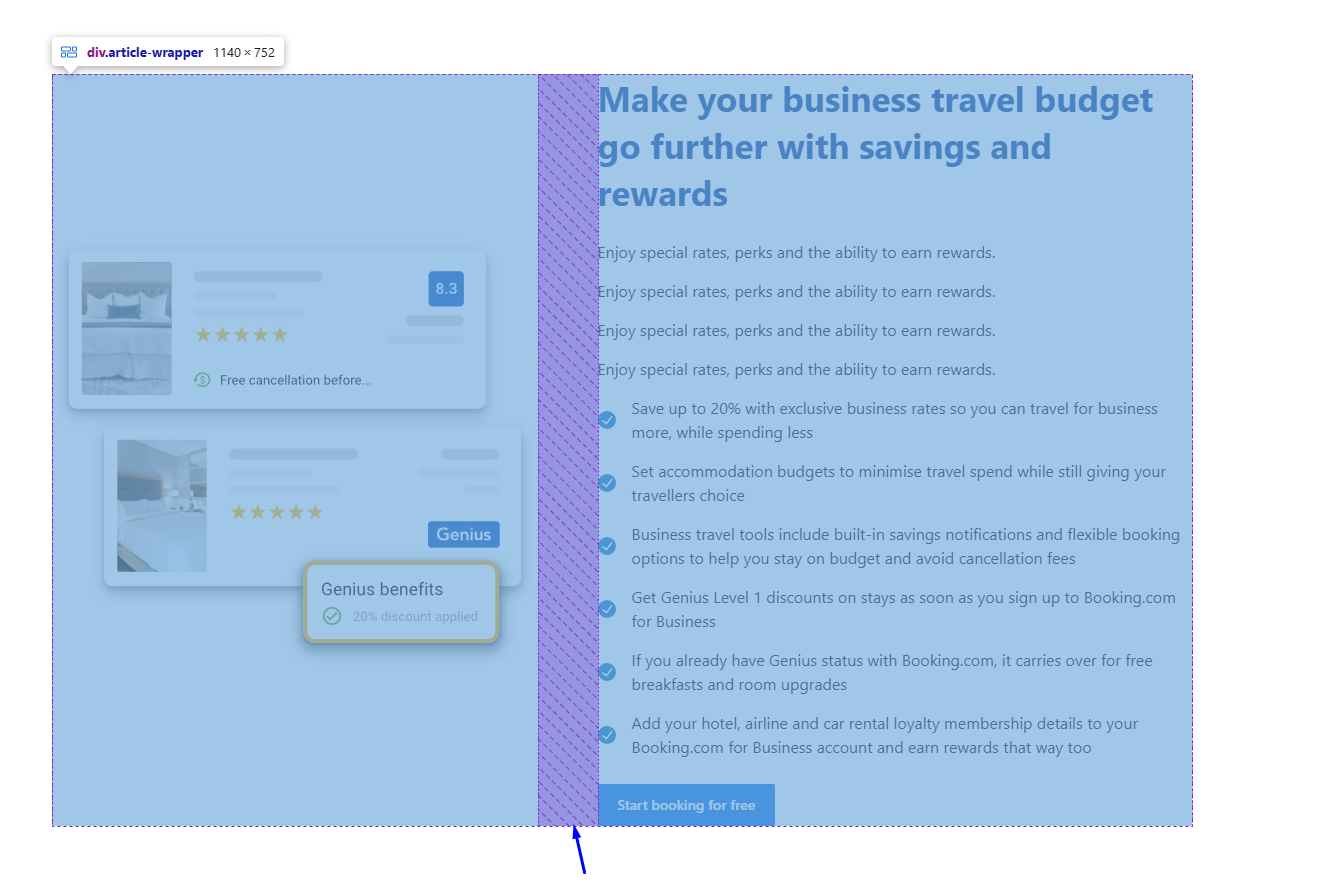
- 60px (for text elements - see first screenshot)
Spacings between blocks in one section 60px (default)
Spacings in block content between elements 25-30px (default)

Spacings between paragraphs (etc. text elements) in text block 15px (default)

Spacings between media and content 60px